New year, new closet!

Time to reorganize your closet to maximize your storage space and have more peace of mind. Reorganizing an entire closet can be daunting and oftentimes requires the help of a professional, so here are four simple organization tips you can do on your own that can make a huge difference in how you use your closet.


Hanging space and shelving typically can’t be changed without a complete closet renovation, but you can maximize shoe space whether you have a builder-grade or custom closet. As an ex-sneakerhead, I know that fitting more shoes in your closet is always a win, but visibility of those shoes is equally important. I’ve even seen clients accidentally buy 2-3 pairs of a shoe that they already owned because they couldn’t see them in their space!

Before #1.jpg
After #1.jpg

Staggering Shoes - Rather than storing shoes side-by-side, stagger one behind the other, tilting them slightly to one side, thus utilizing more or your shelving space. This trick really only works for women’s heels, but rather than 3 pairs of women’s shoes on a 24” wide shelf, with this trick, you can easily fit 4-5. 

After #2.jpg

Boot Clips On Hanging Rods - This is a great solution for those knee-high boots that everyone has trouble storing. Knee-high boots either flop around at the bottom of your closet or stay in their boot boxes, taking up unnecessary space. Boot clips on a low-hanging rod is a great way to keep them organized and maximize space. I’ve seen a client neatly store 20+ pairs of knee-high boots in a small storage space. Here is the link to the boot clips and while they are categorized as laundry clips they are perfect for tall boots.

Before #3.jpg
After #3.jpg

Clear Shoe Bins - This is a perfect way to maximize shoe storage in closets with fixed shelves that are spaced further apart. You can stack shoes 2-3 rows high so rather than 3-4 pairs of shoes on a shelf, you are storing 9-12 pairs. You also get an added bonus of keeping them dust-free. Here is the link to those shoe bins.

5-IMG_7337.jpg
6-IMG_7339.jpg
7-IMG_7341.jpg

Slim Hangers - Results will vary based on what clothing you are hanging, but for blouses or dress shirts, slim hangers help maximize your hanging space (I personally like the slim hangers from Bed, Bath & Beyond). These hangers don’t work well for all clothing though -- suits and sweaters hang better on regular wooden hangers. Here is the link to my preferred hangers.


A common habit I’ve also seen in many of my most organized clients is organizing clothing in different sections based on utility. They store work shirts, suits, and casual/weekend clothing in different sections so all their clothing options are in front of them when they get dressed. This isn’t an option for those with smaller closets in DC and Arlington, but if you have the space it’s a great way to organize your closet.
The key to success with a well-organized closet is just doing a little bit at a time. Start off organizing one area, maybe get rid of 1-2 articles of old clothing, and before you know it your entire closet will be tidy. Whether you want piece of mind or space for more shoes I hope you find these storage tips helpful!

David Townsend

Top Interior Design Trends for 2020

As time moves forward so do design trends and styles, and a new year brings unique ways to decorate your home. 2020 will come with some bold, eye-catching new design trends that will look great in any home. With all of these new and exciting ways to decorate your home, we asked some top interior designers located across the nation to share what styles they think will capture your interest in the coming year. If you want to tackle this new year in style, keep reading to learn what these experts are seeing as top design trends for 2020, as well as some tips on how to incorporate these looks in your own home.

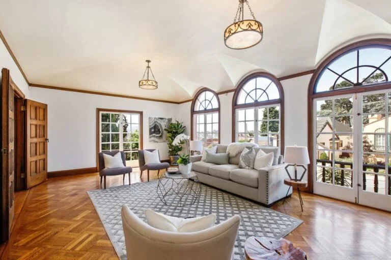
1650-Plymouth-Ave_90-768x512.jpg

Seattle Staged: The year 2020 is pushing the limits with interior design trends, blending old with new and bringing some unexpected things to the table! Many tried and true designs such as the all-white kitchen are out, and we will be focusing on bringing in the Pantone Color of the Year, classic blue as well as its competitor, green into the mix. Off-trend is on trend this year, so limits will be pushed with vintage accent pieces, high contrast and surprising with the unexpected.

Blakely Interior Design: With a bright aesthetic and brave approach to design, we inspire our clients to live vibrantly by infusing color into every home we transform. Gone are the days of all-white interiors; research has shown that color has a profound impact on our everyday well-being, and Blakely is masterful at using it in engaging ways through vibrant textiles, wallcoverings, and accessories. Want to incorporate color into your home, but don’t know where to start? Throw pillows are typically the easiest, fastest and most affordable way to do so.

Lissette & Chelsea, La Finca Interiors: 2020 is all about authenticity. In other words: anti-trend. Collected pieces that show your true personality are coming out of attics and storage bins in a big way. Don’t be afraid to display that old yearbook on top of your Tom Ford coffee table book, or the small figurine you purchased on your trip to Tokyo. The trick is to edit and keep items feeling special by only displaying a few at a time. Great design is a process that takes time, should feel collected and, just like our January diet, is better in moderation.

Kim, Design Confetti: Dark accents to create drama and contrast in a room. While painting a room or even a wall dark can be too big of a commitment for many, choosing to use a deep shade or even black on an accent creates a dramatic focal point for the room. Painting a fireplace a deep gray is a refreshing take on the painted brick trend or drawing the eye towards a view with windows framed in black. We chose a nearly black shade on our built-ins to create a dramatic display that pops, then carried the color around the room by matching it to the baseboards. 

Joanne Palmisano, Joanne Palmisano Interior: Eco-design, including the three Rs– reuse, reclaim and recycle. Today’s home will feature products that have recycled content in them (tile, metals, countertops, carpet tiles, and textiles), reuse of vintage finds, furniture and rugs as well as reclaimed wood used for mantels, cabinetry, decorative trim, and flooring will all play key roles in today’s home renovations and building projects. 

 Les Bernabi, Ciao Interiors: Clean, Crisp and Color will usher us into the new decade as furniture will have clean lines with textured fabrics and crisp blue tones. We love this years’ choice as it can be incorporated into any design style, marring the likes of traditional and contemporary design or rustic and minimalist design in a more unifying and calming manner. We all can all resonate with either the crisp blueness in the sky, deep blue of the ocean, clean airy blues of the mountains or the vibrant blues in a city – all of which are rooted in this ever translucent azure color that Classic Blue brings out. These trends will transform any space.

Denise, Denise Morrison Interiors: Leather fringe on stools, lighting and other furnishings as embellishments will definitely be an emerging trend this coming year. Moving away from strong geometric shapes and styles of recent past we are in the midst of a transition to softer silhouettes. You can expect to see many pieces with softer arms, curved backs, and oval dining tables.

Room Sketcher: 2020 from our perspective is all about universal design. We see thousands of floor plans being created in the RoomSketcher App every day, and universal design is really on the rise. Universal design is all about creating living spaces that are usable by all people, from children to seniors, regardless of ability or disability. To incorporate the style, create a floor plan with wider door frames and wide hallways, low to no thresholds, add bright, motion-sensitive lighting and countertops of varying heights.

Michael Helwig Interiors: Introspection should be the buzz word for 2020. The world of self-care and personal enrichment translate into minimalist, “Zen” Interiors: the core elements that promote calmness, tranquility, and comfort. Think basic geometric shapes like circles and rectangles paired with straight lines in furniture and tabletop decor. The whole trend is unfussy, peaceful and earth positive. A great way to introduce this trend to your home is to embrace natural elements: stone, natural wood, wool and plants as decor. Natural artifacts like crystal specimens and man-made wood carvings add in a definite feeling that reinforces this trend.

Beth Dotolo and Carolina Gentry, Pulp Design Studios: Using every single square inch in the home – but in new and unique ways. Like creating a hidden wine room in the boring space under the stairs. Or fashioning a secret playroom under the eaves of an attic room. No more wasted spaces!

The Design Inspiration & Design Bump: Smart homes have been the trend in recent years, but with more people becoming conscientious of problems like climate change and sustainability, 2020 will bring increased incorporation of environmentally sustainable home elements, such as recycled wood and indoor garden-based designs.

Younique Designs: The biggest design trends we are seeing would be bold graphic shapes in everything from tile to fabric to wallpaper. Also, a return to color in the kitchen whether it be in the form of fun color on the cabinets or backsplash to even colored marble. The color green is really trending in our market. We are currently doing high gloss emerald green cabinets in a bar across from a kitchen that features a graphic shaped mosaic tile with various bold colored stones including green marble!

Sarah Jacquelyn Interiors: Mango wood is on the rise; this durable wood is perfect for furniture, home accessories, and beautiful sculptures, showcasing a unique and stunning wood grain. Mango wood is a sustainable and renewable resource, making it a popular choice among the environmentally conscious. 

W Design Living: We are entering a new decade on the leading edge of designs, kicking off 2020 with a bold personality and unique self-expression. Colors that bring drama combining deep shades or black into rooms, cabinetry, hardware and finishes for contrasting effect. The unique application of marble in combination with different materials introducing a whole new design of spaces and products. We will discover many unexpected ways to add interests and fun, play with unusual shape accents, curate one of a kind space and make a visual statement with walls and ceilings.

Lindsay Saccullo Interiors: Clean Lines and Curves, What’s old is new again. Curved sofas and other upholstery give a nod to 80s silhouettes but clean lines, minimal adornment and simple, textured fabrics provide a modern update.

Karen Attwell, Form Interiors: In the year ahead we see a greater focus on connection to nature in our homes. Aesthetically that means more organic shapes, tactile surfaces, and nature-inspired palettes. Understanding how things are made and learning more about the finishes and materials being used in our homes is more important than ever.

The Model Home: High contrast is the name of the game- whether it’s a black chair with white legs or a bold trim or door color that pops against a more neutral wall, the more contrast the better! Take contrast in a different direction: when working with furniture, art, or textiles, mix modern and vintage pieces to create a fun juxtaposition. Mixing old and new is definitely my favorite way to create eye-catching spaces, so let’s hope this trend is in for the long haul!

Mindful Design Consulting: Dramatic Lighting. As everything in 2020, light fixtures tend to take a playful turn. The same mid-century influence will be seen in the lighting field, with brass frames, white lampshades, and geometric, even futuristic designs. The fun will sometimes translate into using unexpected and interesting materials, such as yarn or recycled cardboard, that feed on our desire to experiment and be environmentally minded. Other times, the look will be dramatic, with light fixtures covering an entire ceiling or creating a cascade of lights.

Sustainable Home Interior Design: I hope all clients feel that this is the year to update your home with the style you truly love, it is the one trend that is truly timeless. Following a trend creates a home that might feel dated, and does not express your true personality. With that said, I feel the tide is finally changing away from gray, black and white, and towards color. 

Sofa Creations: Our customers want more unique styles. With homes being smaller, people like to have their sofa be their statement piece.  Having details like wood trim and more vibrant colors are the most popular right now.

By Design Interiors: Carefree, Easy Living! There is a HUGH shift towards carefree, low-maintenance livable interiors. We accomplish this by incorporating high-performance fabrics, such as Crypton. Durable wallcoverings are hot within the design world right now! And of course, “all things washable.” Home Automation is taking the lead for easy living in everything from landscape systems, media, lighting, window treatments and so much more. These additions allow for more family-friendly and worry-free interiors!

The Habitat Collective: We think that high contrasting tones, bold, sculptural lines and luxurious natural texture are going to be huge trends this year. There are easy ways to incorporate these elements into your home; opt for natural finishes and textural accents such as marble and linen, make a statement with contrasting paint on woodwork and trim and don’t be afraid to go a bit bolder with furniture choices; think more substantial pieces with interesting, sculptural lines!

Tina Marie Singh, Lionsgate Design Inc: A simple meditation room or corner with added personalized elements is going to be a mainstay in design this coming year. We will see the design of spaces becoming sanctuaries, with natural elements of stone, wood, and gentle calming ambiance.  As we transition into a new decade, we are focusing now more than ever on our personal wellbeing and longevity well into the future.

Pamela Harvey, Pamela Harvey Interiors: The final step in designing your room is accessorizing. The art and objects are what pull a room together and give it that finished touch. Don’t be afraid to mix high and low price points. Shop for interesting pieces in a variety of shapes and sizes. Some of my favorite go-to places for accessories are flea markets, antique shops, thrift shops, designer web sites mixed with some Target and Home Goods shopping.

Justine, Justine Sterling Design: Just look up! Ceilings are one of the best ways to add more layers and details into an interior. Imagine a darker color, that connects all of the other pieces in a room. It adds visual warmth and coziness. I have incorporated this into client’s homes by painting and Wallcovering ceilings on different projects often just in one special room. It tends to work best in medium-sized spaces, not in a large great room for instance. If you have Wallcovering on a wall, use the darker tone on the ceiling in a painted finish. Or if the room has neutral painted walls, find an accent color in the room that could be reflected on the ceiling. Have fun with it, but perhaps test out your visual appetite for adding drama in a small space like a powder room.

Blue Returns as Color of The Year

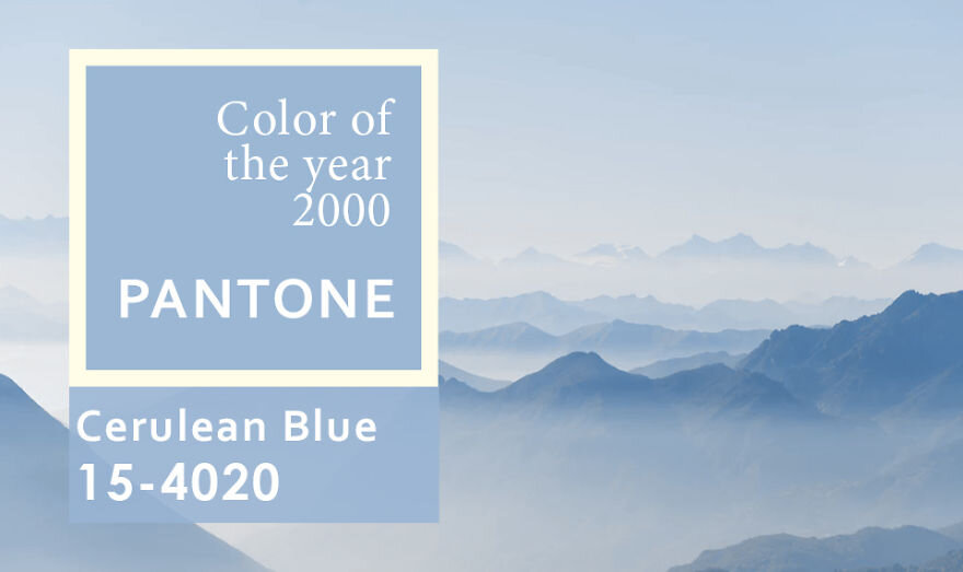
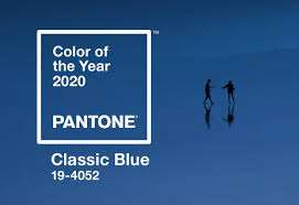
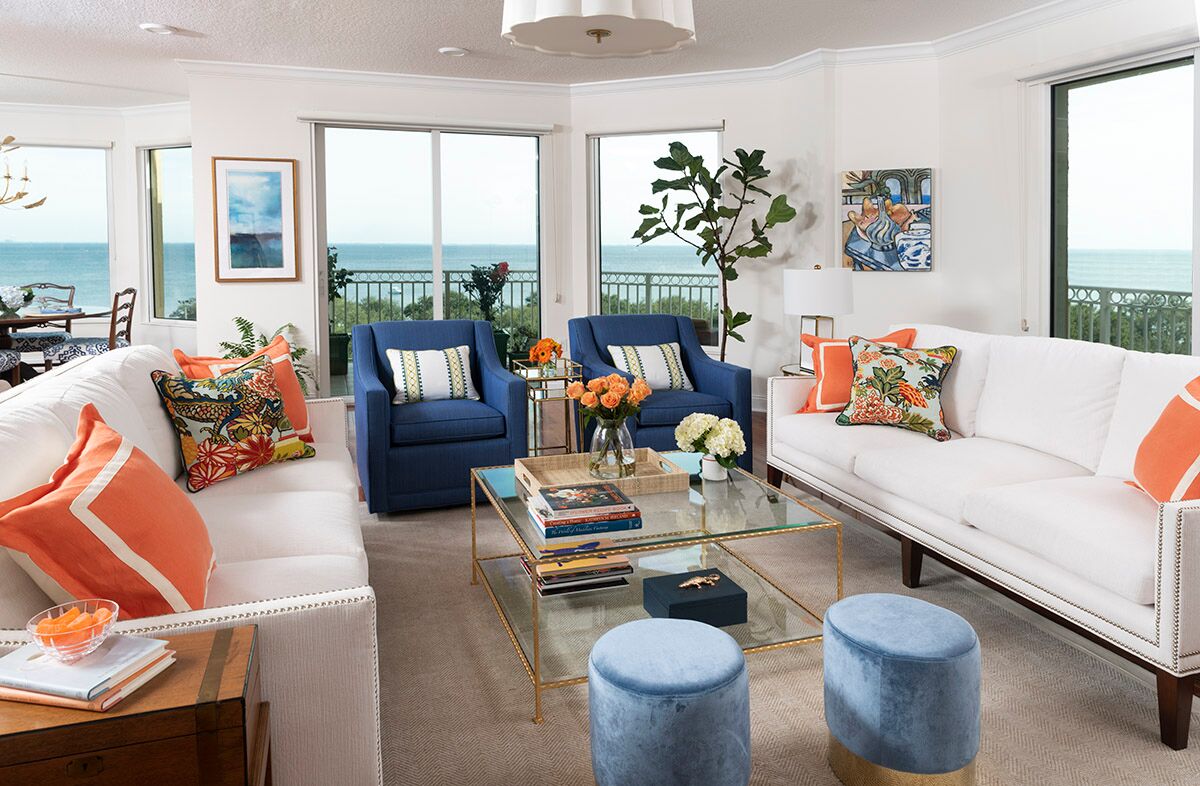
Pantone has been naming a color of the year for the past two decades. Pantone’s first pick was Cerulean Blue in year 2000. Now 20 years later Pantone has chosen Classic Blue as the color of the year. In similarity, it is a familiar, calming shade of azure. In a time of uncertainty Pantone made no mistake with this reliable, tried and true hue.

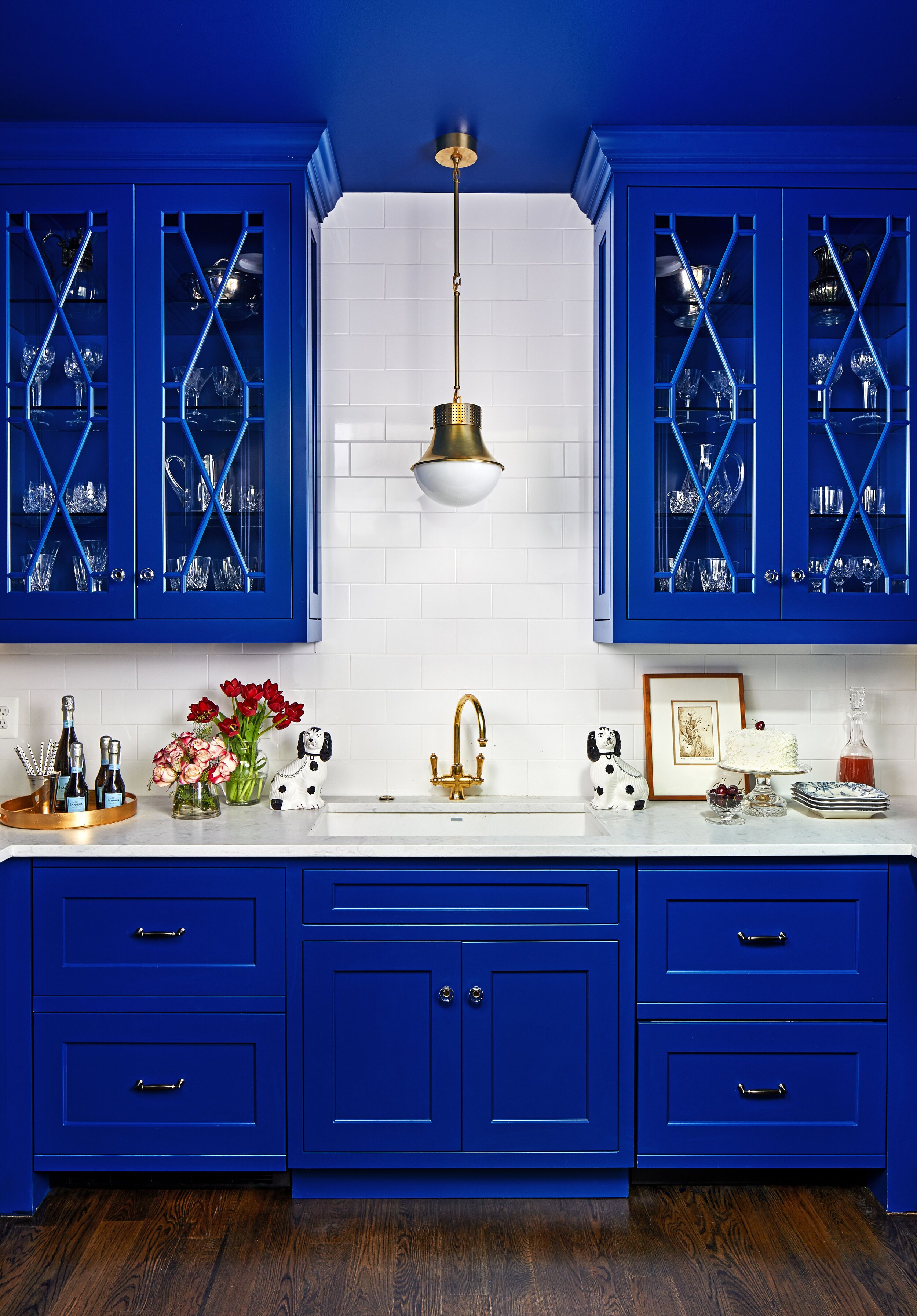
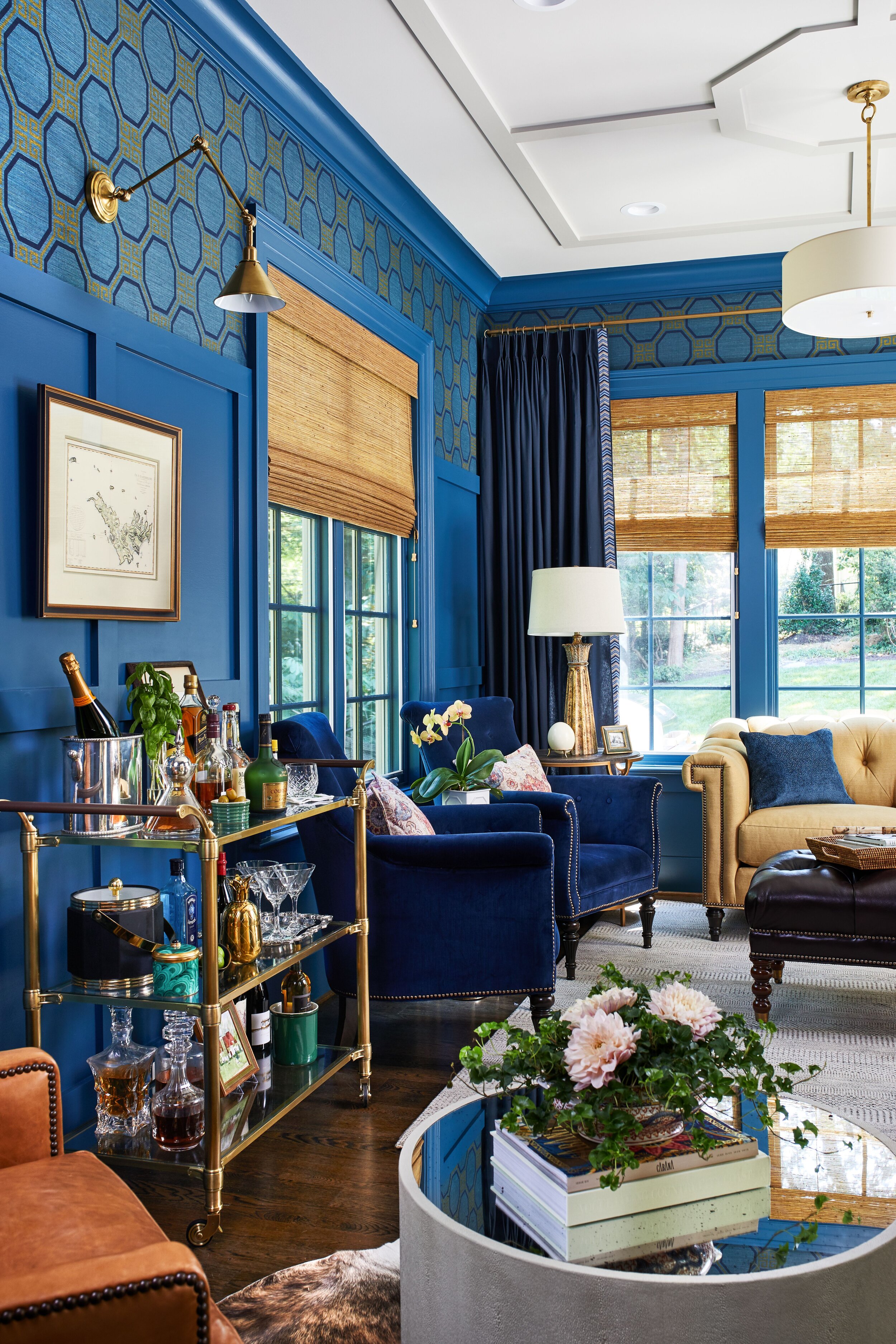
Blues have long been one of my favorite colors to use in interior design. From a psychological standpoint, blue has always represented a certain amount of calm and dependability. It is a color that can stand the test of time —which makes it a great choice for cabinetry. Below are images of a recent butler’s pantry and study we designed for a client in McLean. Who says blue is boring?

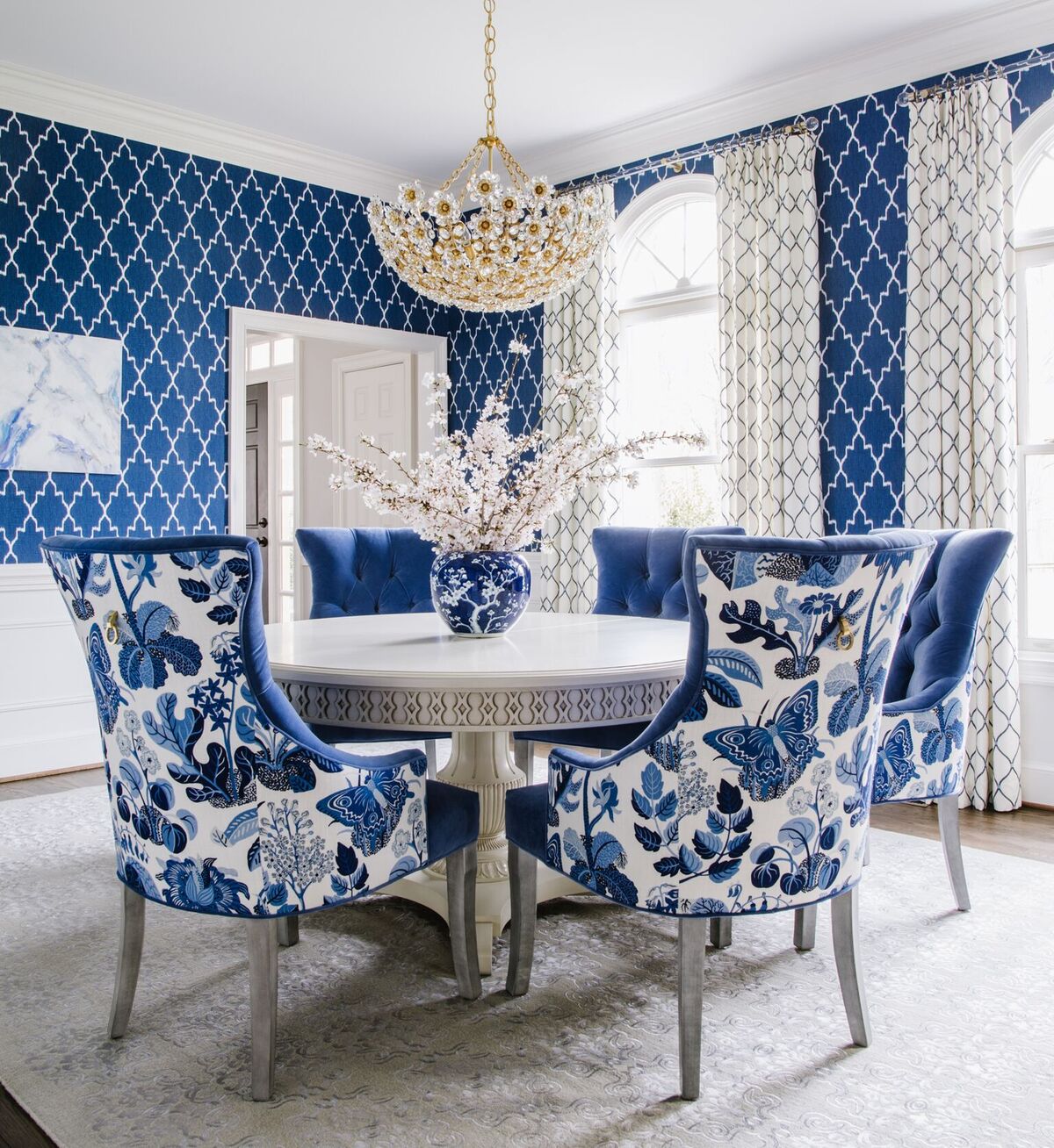
Wrapping an entire room in color —one of Veranda’s favorite rooms of the year is this dining room by Shazalynn Cavin Winfrey. What’s a better application of blue than classic and bold? Also a keen mindset for the new year.

SCW Interiors

SCW Interiors

Not ready to go all in with a room saturated in blue? Adding subtle details to a neutral space can readily bring a room to life. Keep pops of color to lighting, pillows, and even barstools. These items are easily interchangeable as you want to experiment with new color trends throughout the year.


Living Coral -So Long, Millennial Pink

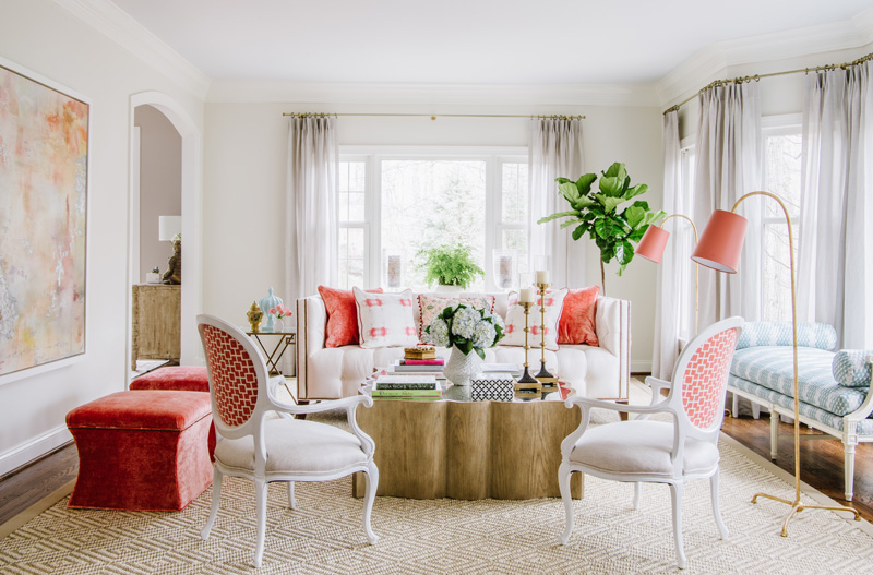
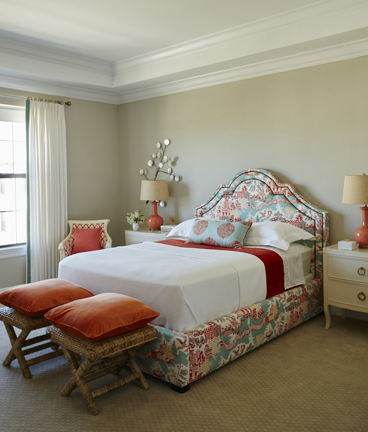
By now most of you have heard Pantone has selected Living Coral, a bright coral shade, as its 2019 Color of the Year. It is said that in a time where digital experiences can be cold and isolating, Living Coral feels optimistic and intimate. I’ve never met a color I didn’t like and shades of coral top my list of favorites. And in March it makes me feel so close to spring. Mother Nature’s best inspiration of course is the Flamingo.

19046487_303.jpg

Coral is a great accent or splash of color in a room, as it plays well with others. Looking back at last year’s projects we have used it as our accent color in three family rooms, a breakfast nook, and powder room. Each time mixing it with grays and blues. The result is always fresh and happy. Here are a few examples of how you can use coral to freshen up a room…or two.

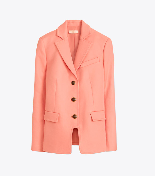
Paint is the fastest way to awaken a room. Peachy hues are most flattering to skin tones.
Dw1y8RdWoAAk8UF.jpg

Add a fun pop of coral with throw pillows. They pack a punch and can easily be changed out seasonally so you aren’t making a huge commitment to the color.

IMG_5208.jpg

Brighten a kitchen instantly with coral dishes, napkins, linens and accessories.

Not ready to color a wall? Make a bold impact with a striking piece of abstract art.

r6a5PkyQ.jpeg

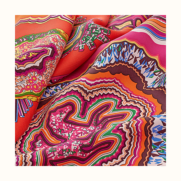
When fashion inspires so many design elements, they truly go hand in hand. Don’t forget about your wardrobe when it comes to coral. An Hermes scarf will always do the trick ;)


New Year, New Inspo

Screen Shot 2019-01-20 at 4.41.13 PM.png

Since the New Year I can’t stop thinking about champagne, maybe inspired for my love of Veuve. Clink Clink! The color champagne, if you are looking for an elegant timeless neutral, is perfect alone or mixed with others. Color trends come and go, but champagne, in both drink, and design, is classic and here to stay. 

I just returned from the Atlanta market, which is much smaller than High Point market and geared toward accessories, rugs and soft goods.

Screen Shot 2019-01-20 at 2.00.57 PM.png

This makes it easier to shop, and a great time to catch up with the manufacturer’s reps. Even after 20+ years in the business I am always learning new things and getting new ideas. I was interested to see and hear what was selling now and any overall color trends. Blue is still number one for many showrooms. Especially blue tones for rugs. But my all time favorite is champagne or a pretty shade of beige.


My love for champagne was truly sparked back in my Liz Claiborne days, when every store or shops’ walls were covered in the perfect shade of champagne beige wall covering. The ideal canvas for everything. Here are some of my favorites from market.

Start the day with a smile, and end it with champagne.

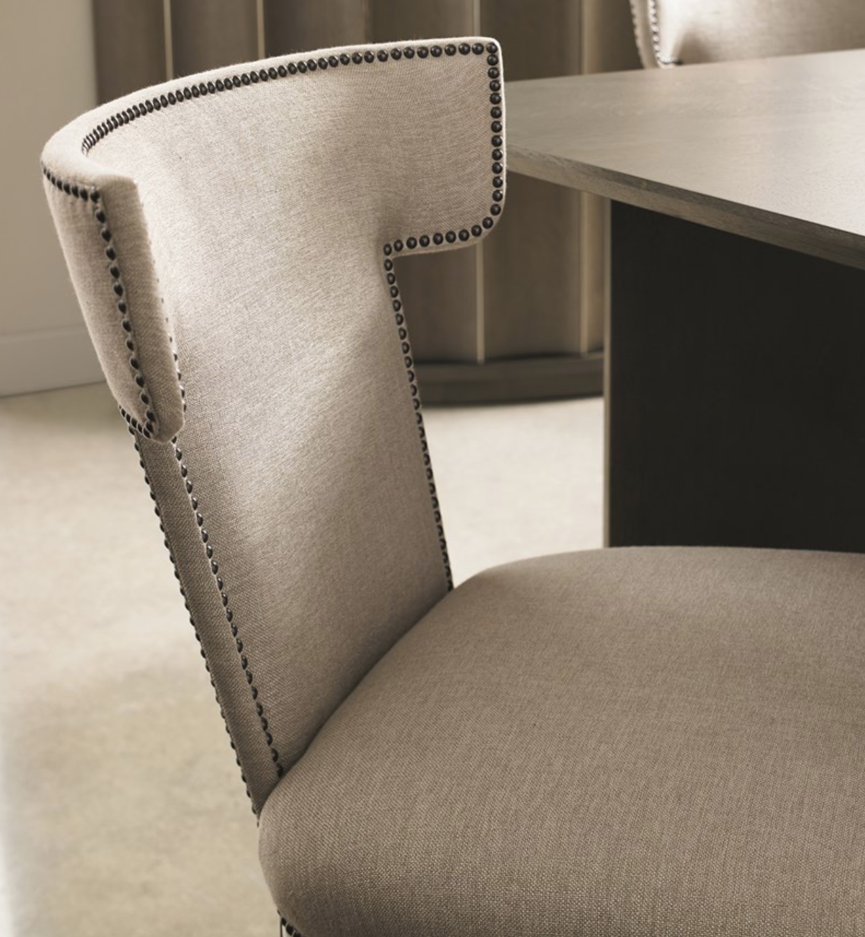
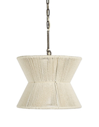
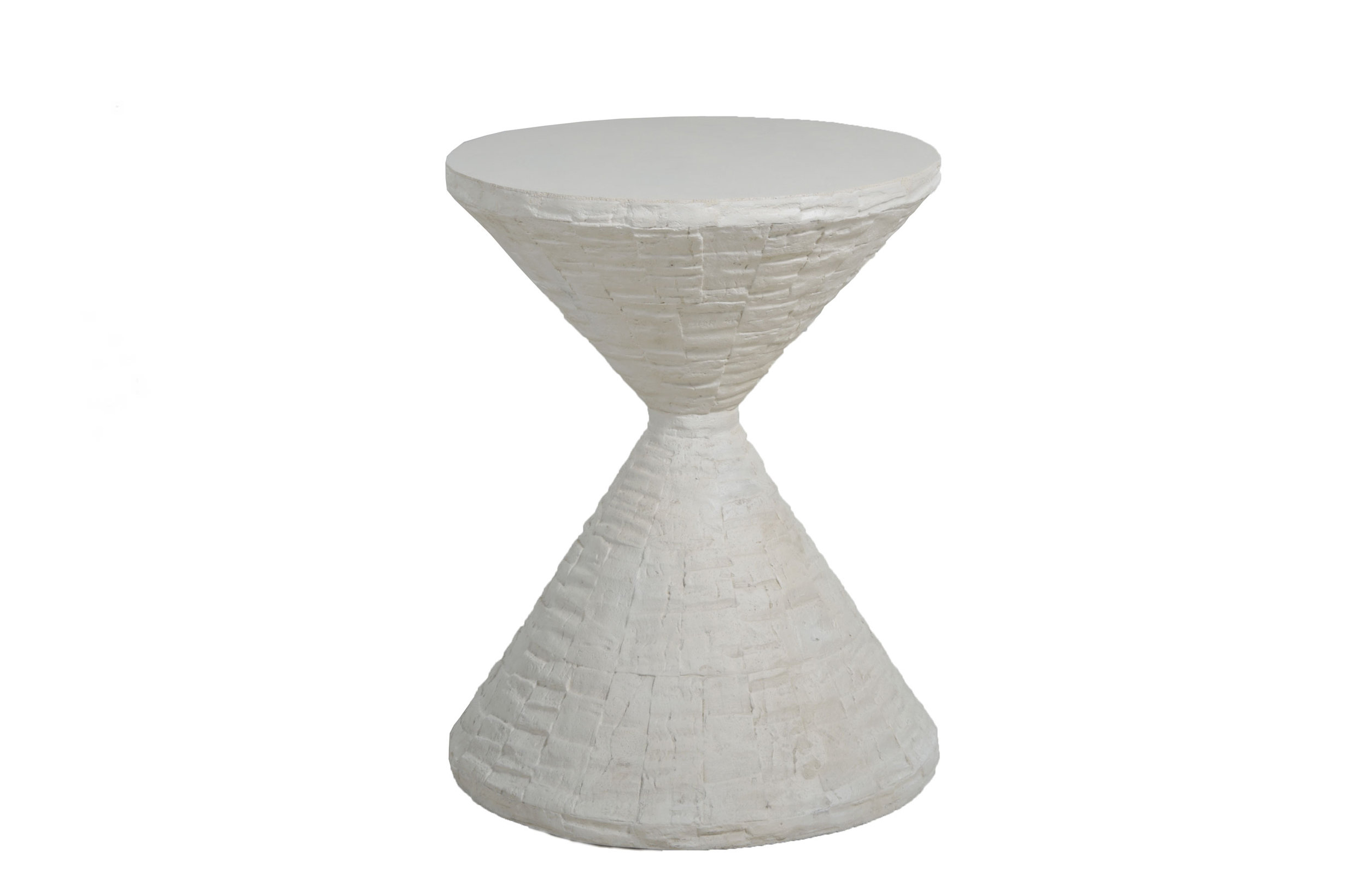
I am not sure what I love more about this Uptown Dining chair by Caracole -the silhouette, or the fabric, or how well one compliments the other. For some coastal charm, this Gordon pendant by Gabby is so fresh, it will instantly update a kitchen, dining room, or bedroom by adding some casual elegance. Also from Gabby, the Lindy side table could not be ignored for her enviable hour glass geometry and texture with a stone top. Designer pillows were everywhere of course. By far the easiest way to elevate a solid sofa for a new look. Full disclosure, I think I ordered all of these, plus some solid mohair pillows.

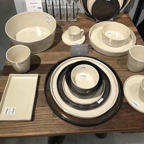
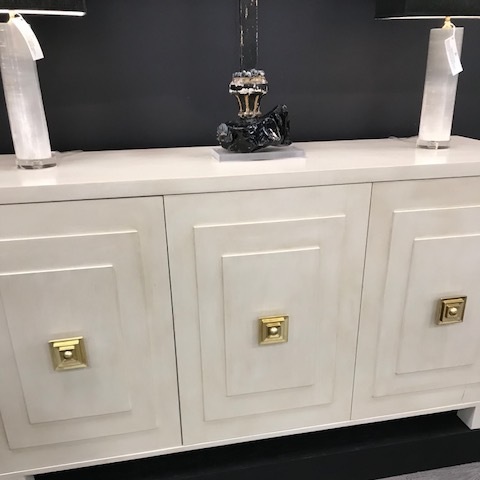
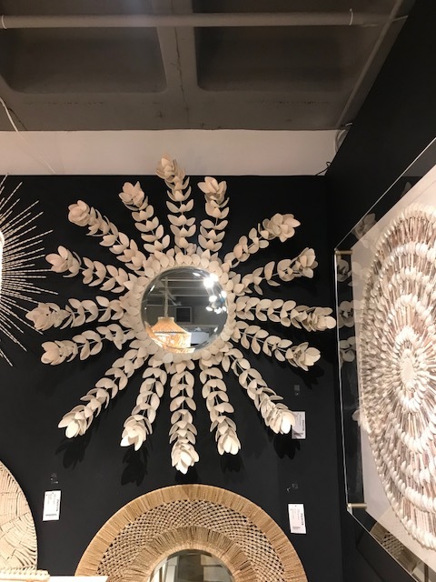
Maybe after all those resolutions to get organized you have room for some new dinnerware.  These from Costa Nova, pattern Lagoa are made in Portugal and look like they belong in an upscale restaurant. I love the unexpected mix of the Champagne and Metal, feels trendy and timeless all at once. The Palladin Buffet from the ever unique duo Twitter Feefer is a classic investment piece you would have forever. A new spin on a mirror. This Coco Magnolia mirror from Palacek, made from bleached coconut shells, hung on a dark wall is a work of art -what a pop! This pair of art by Thom Felicia for Wendover Art Group would be complimented enough by a simple wall, or add some busy wall covering for some added interest. I binged watched his new show “Get a Room” last weekend while putting away the holiday decor. I had the chance to meet Thom in Atlanta and I was relieved to find he is as charismatic in real life as on TV.

Here’s to 2019! Freshen up the old, and bring on the new. We step into the new year with gratitude for our clients and projects that keep us seeking novel inspiration every single day.


Thankful & Grateful

With Thanksgiving here and the holiday season in full bloom, we are taking a moment for gratitude. Our team is very thankful for you, our clients. You are the reason we do what we do. Your expectations are of the highest level, so every day we aim to surpass them in the most beautiful way.

pc: thekitchenmccabe

pc: thekitchenmccabe

You let us into your homes and hearts. We enjoy the journey of getting to know each of you and designing a space that reflects you specifically. We love seeing the mood of a room change, but the greatest satisfaction is working with our clients and improving the way you are living in your homes.

We wish you and your families the happiest Thanksgiving -filled with gratitude, love, and beauty. We are ever grateful for you and your trust in what we do.


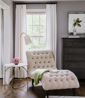
Design Spotlight: The Reading Nook

house.jpg

Recently we were featured in publications such as the San Francisco Chronicle, ABC News, and the Washington Post, for our approach to creating cozy reading nooks at home. Today we are sharing some of our favorite tips for how and where to have your perfect nook.

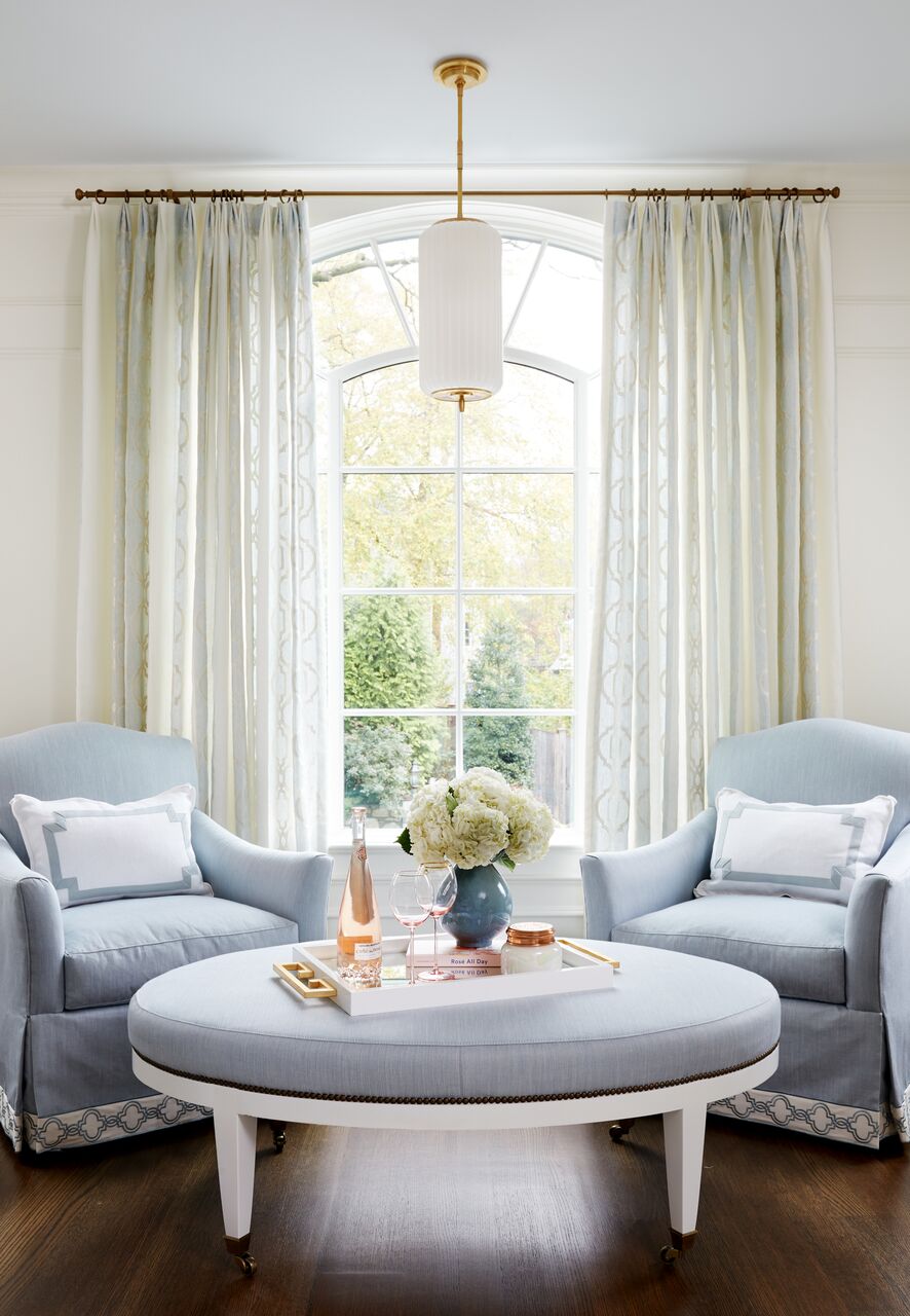
The dog days of summer are fading, where lounging anywhere outdoors with a book and a glass of Rose were so simple. With the arrival of fall, busier mornings, and back-to-school chaos, it is important to maintain that downtime. We believe a well designed reading nook is not only a beautiful opportunity to add character to your home, but good for the soul.

940x940.jpg

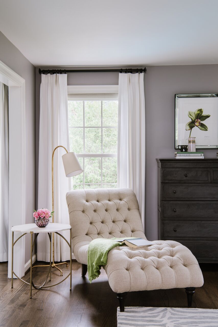
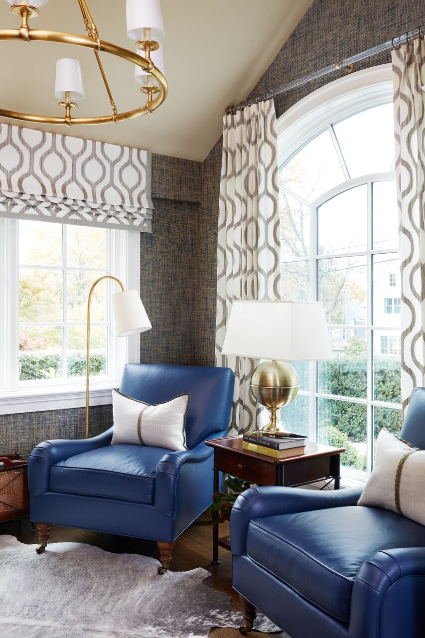
We decorate our homes in order to enjoy them. For book lovers, adding a cozy and well-lit space dedicated to reading can be the perfect finishing touch. Most homes, of course, don't have a spare room for use as a library. We often carve out one section of a living room, sunroom or master bedroom as a dedicated reading area.

Where you put a reading space depends on your habits. I ask my clients, are you seeking a spot that's private and silent, or would you rather have an open, airy reading space to share with family members?

Drink tables next to chairs (swap Rose for Red or PSLs?), throw pillows and cozy blankets add style and comfort. Consider adding a small rolling bar cart or even a wet bar if your budget and space permit.

kia.jpg

You'll want to build in the flexibility to have different levels of light in your reading space. I always suggest a mix of table lamps, floor lamps, and small reading lamps. Task lamps also work really well! Along with plenty of spots to plug in all this lighting, don't forget to have enough outlets for chargers if you'll be reading on a digital device.


Trend is the New Classic: Kitchen & Bath Design

Kitchen and bath remodels tend to be a big investment for our clients. Balancing timeless, quality design with home trends is the key to a successful project. With the growth of social media over the last decade, it is overwhelming for our clients to make sense of their Houzz look-books, Pinterest pins, and never-ending Instagram feed. They rely on our expertise to help them visualize the big picture, while incorporating design trends they are gravitating towards. Today's Kitchens and Baths are focused on combining interesting materials -giving a fresh take on transitional style. Below are our favorite elements playing into that theme.

design by @pamelaharveyinteriors

design by @pamelaharveyinteriors

PAINTED AND COMBINATION CABINETRY:  Homeowners have been told for years that one of the easiest ways to freshen a room is to paint the walls.  Now we are seeing this tried and true concept flowing over into cabinetry.  We are choosing strong and bold paint colors in addition to the classic white, and even combining multiples throughout the space. Behr has caught on, with their color of the year: Blueprint.

design by @havendesignandconstruction

design by @havendesignandconstruction

STATEMENT LIGHTING: A smart way to keep a transitional space timeless but still have fun with trend is lighting. Lighting is becoming bigger and more impactful. Above, these oversized kitchen pendants pack a huge punch! The theme overall is transitional and classic. The homeowners aren't committed to this lighting trend forever. The result is a kitchen that feels classic yet on trend and so fresh. #kitchenenvy

design by @the_brothers_stonington

design by @the_brothers_stonington

QUARTZ COUNTERS & WOOD ACCENTS: We're saying goodbye to busy patterns of granite and ushering in the more solid looks of marble and quartz countertops.  We are seeing wood accents being incorporated throughout spaces on more than just floors. Butcher block countertops, reclaimed wood walls, and open wood shelving are having a major moment that is due to stick around for a while.

design by @jaclynpetersdesign

design by @jaclynpetersdesign

TILE PATTERNS, CEMENT TILE & RUGS: Talk about a wow factor!  Even simple tweaks like laying subway tile in herringbone patterns elevates interest. Bold geometrics are emerging everywhere. We're installing tiles as accent walls in bathrooms, kitchens, and bars. If a homeowner isn't ready to commit to tile, another impactful option is choosing a bold rug -bonus, this is also very on trend! (Same concept as adding playful patterned pillows to a solid sofa).

design by @pamelaharveyinteriors

design by @pamelaharveyinteriors

GOLD, BRONZE, & MIXED METALS:  There is no longer one right answer when it comes to choosing a hardware finish. The dated "only one metal" rule is gone, opening the ultimate opportunity to mix and match within a space. Its been as freeing as when we moved past the "no white jeans after Labor day" rule. Layering a space with metals that work together in harmony, but add the interest of juxtaposition to a space is our goal. Gold hardware and plumbing now combine with stainless appliances with ease. This trend is actually becoming the new classic.

design by @sophieburkedesign

design by @sophieburkedesign

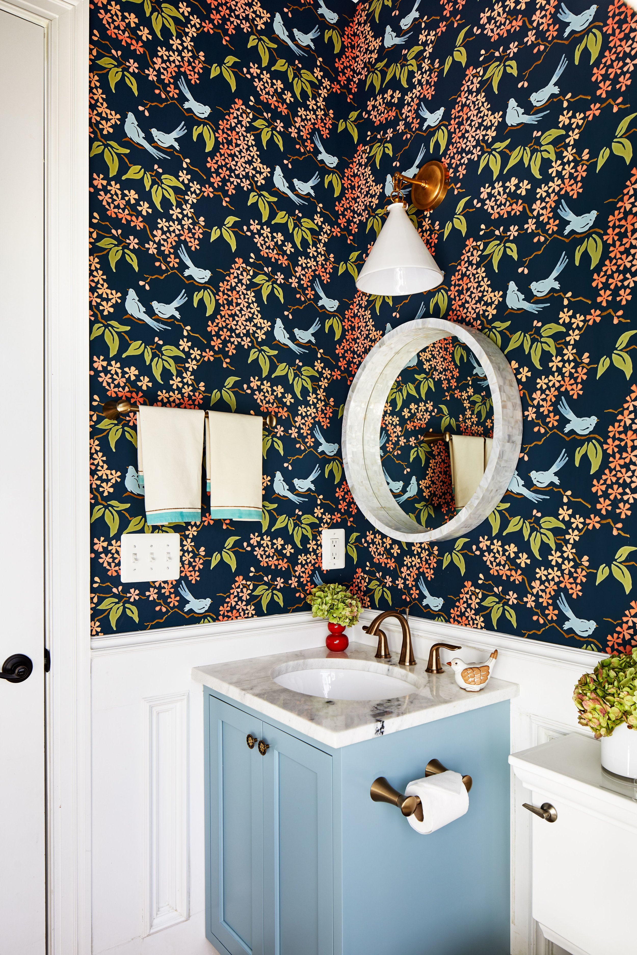
SHIPLAP, OPEN SHELVING, WALLPAPER: Whether adding texture with shiplap or pattern with crisp wallpaper, we're finding the walls a prime opportunity to add interest to any space. Elements like open shelving offer an even bigger opportunity to layer in design elements through functional and decorative accessory displays. We love to add fun wall coverings especially to a powder room, letting your personality shine for your guests, while you aren't staring at the pattern all day.

design by @pamelaharveyinteriors

design by @pamelaharveyinteriors

design by @beckiowens

design by @beckiowens

New & Noteworthy From High Point Market: Spring 2018

Every spring I try to make the journey to High Point, North Carolina for the industry's biggest event of the season. It is a great way for me to discover the latest trends, as well as see what my preferred vendors have to offer that is new. It is an inspiring trip that turns into a great resource when updating my clients' homes.

I typically arrive with a list of key items I want to source for my clients. Many times I will order fabulous lighting, side tables, rugs, and one of a kind art. It is an energized event that leaves me feeling exhausted, but mostly inspired. With people traveling to High Point from all over the world, it is also a wonderful opportunity to collaborate with other designers and see what they are up to on the other side of the globe.

This year I was happy to see bold colors taking the reigns, from millennial pink, green, peacock blue, to yes, even purple. The overall setting was a little less of the past stark modern, and more a mix of modern and traditional -which I was relieved to see.

A pretty pink custom deGournay wallpaper in Suzanne Kasler's showroom. The space is bold, charming, and the white and pink duo always classic.

IMG_9556-600x800.jpg

One of my favorite furniture collections is by Courtney and Randy Tilinski of Bungalow Classic for Highland House. Such a creative and inspiring space.

A more modern take on classic design was found in Mark D. Sikes' collection for Henredon. 50 shades of green left this space feeling so fresh. I particularly love the sleek and timeless cocktail table.

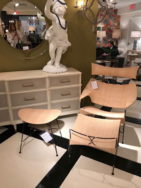
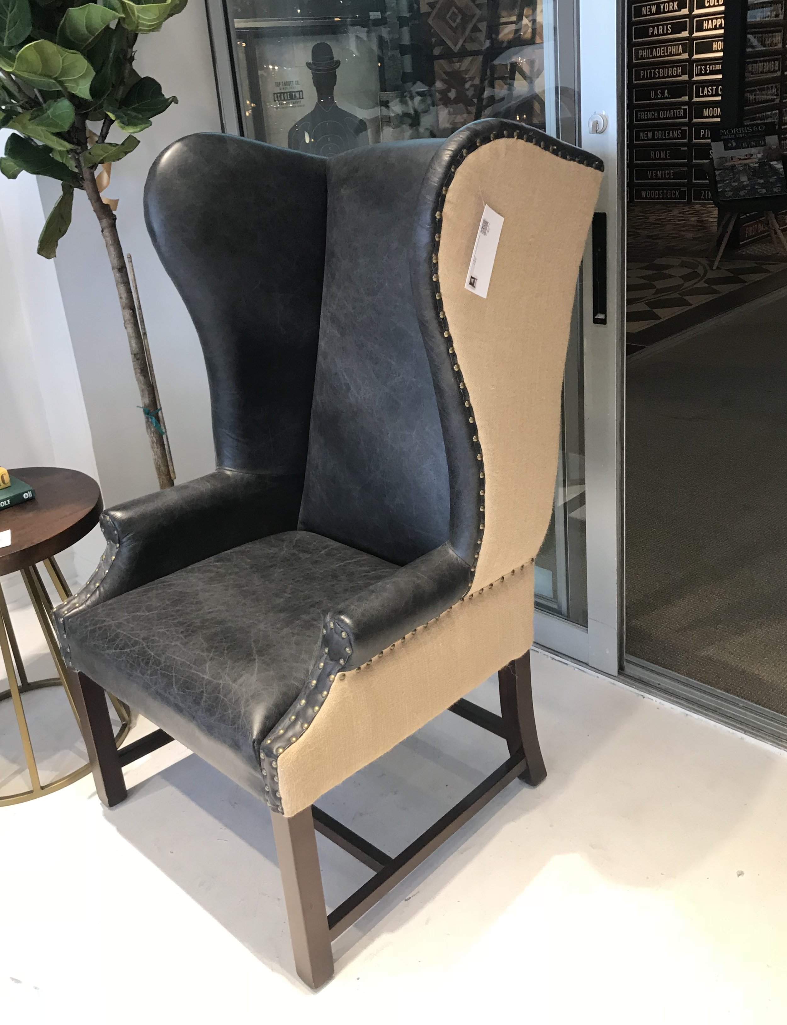
Beautiful vignettes were to be found all over High Point, like this gorgeous trio from Gabby Home. I love the chic mix of natural fibers with iron. I was pleased to see a heavy presence of wing chairs on the floor, always a classic and timeless go-to of mine.

I always tell my clients the secret to a well collected look is mixing old with the new. I love market  because I'm able to find those one-of-a-kind pieces for my clients to create a truly special space.

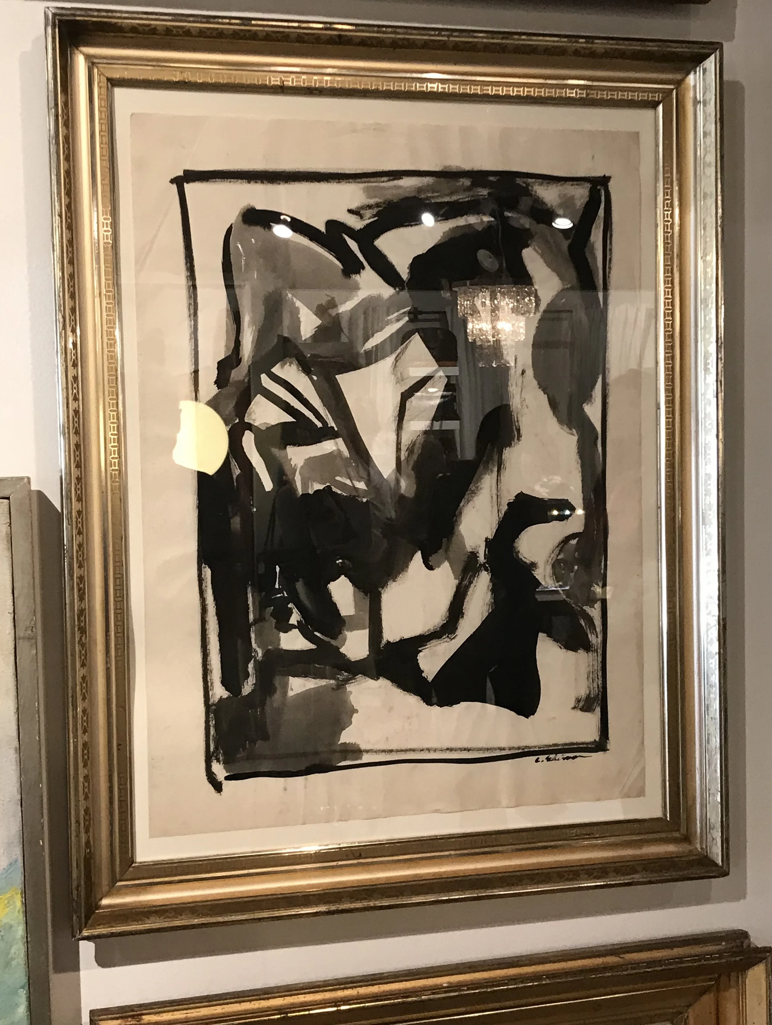
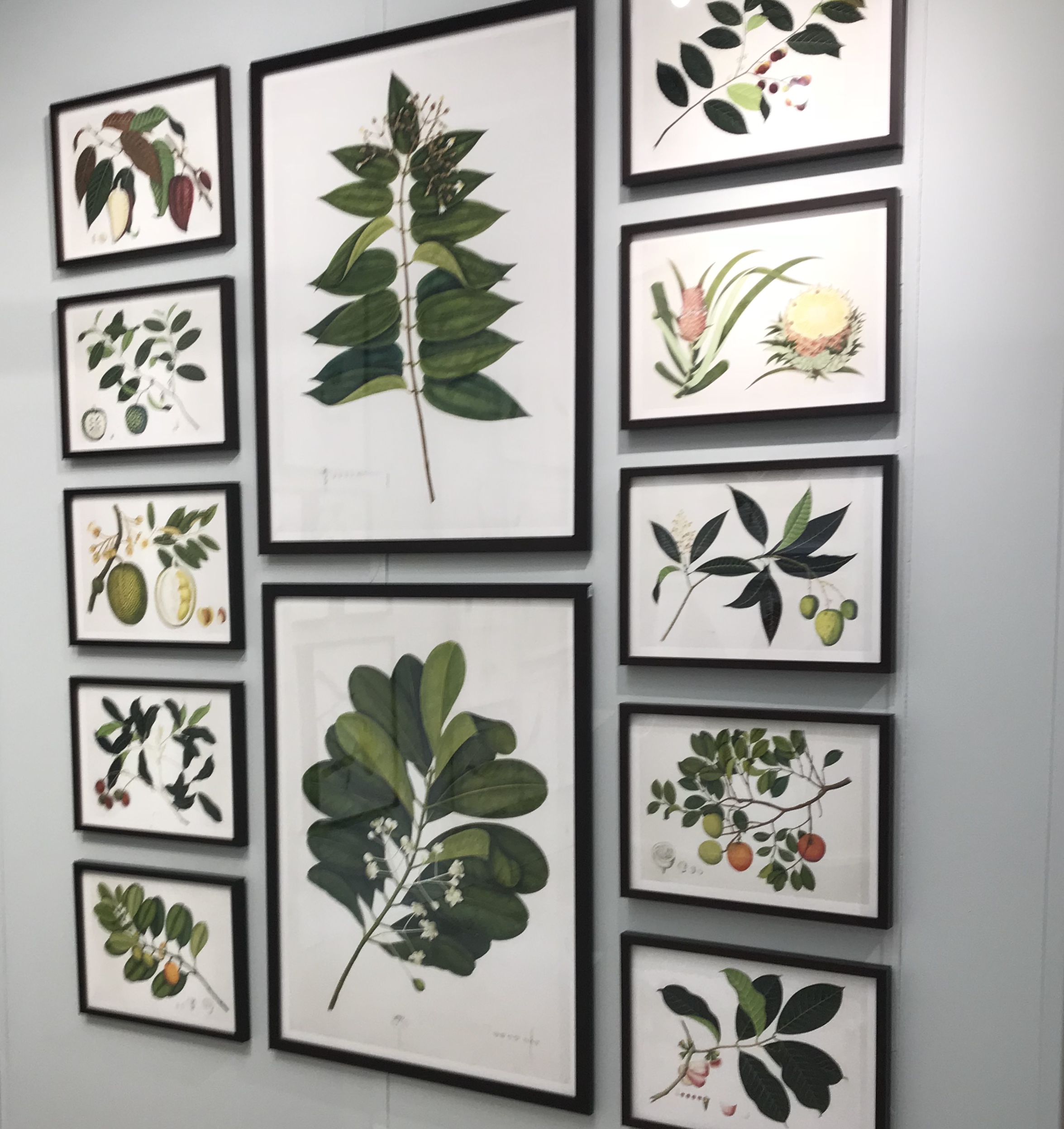
Sourcing art for some current projects, these Anglo-Indian botanicals were so full of life and color. What a fabulous way to bring the outdoors in. What drew me in further was to know these were made by the same artist as the botanicals in Lee Radziwill's iconic bedroom!

Last but certainly not least, rugs are among my favorite finds at market. I love being able to touch and feel these unique textiles on behalf of my clients -giving an accurate description of how it will look and feel in their home.

rug.jpg

Lighting Round Up

I often get questions about the lighting used on our projects. Clients and design enthusiasts are always wondering what the most appropriate lighting for certain rooms is, and how to make a statement in others. I like to tell my clients to think of lighting as "the jewelry of your home." On today's blog I've rounded up some of my favorite fixtures -er gems and how their location suits the look!

Keep in mind, of all the things I encourage my clients to purchase online, lighting is definitely one of the things you can confidently buy without needing to hold, touch, and feel. Let us know if any of these pieces resonate with you –they too can be yours.

pam+harvey_20.jpg

Kitchen

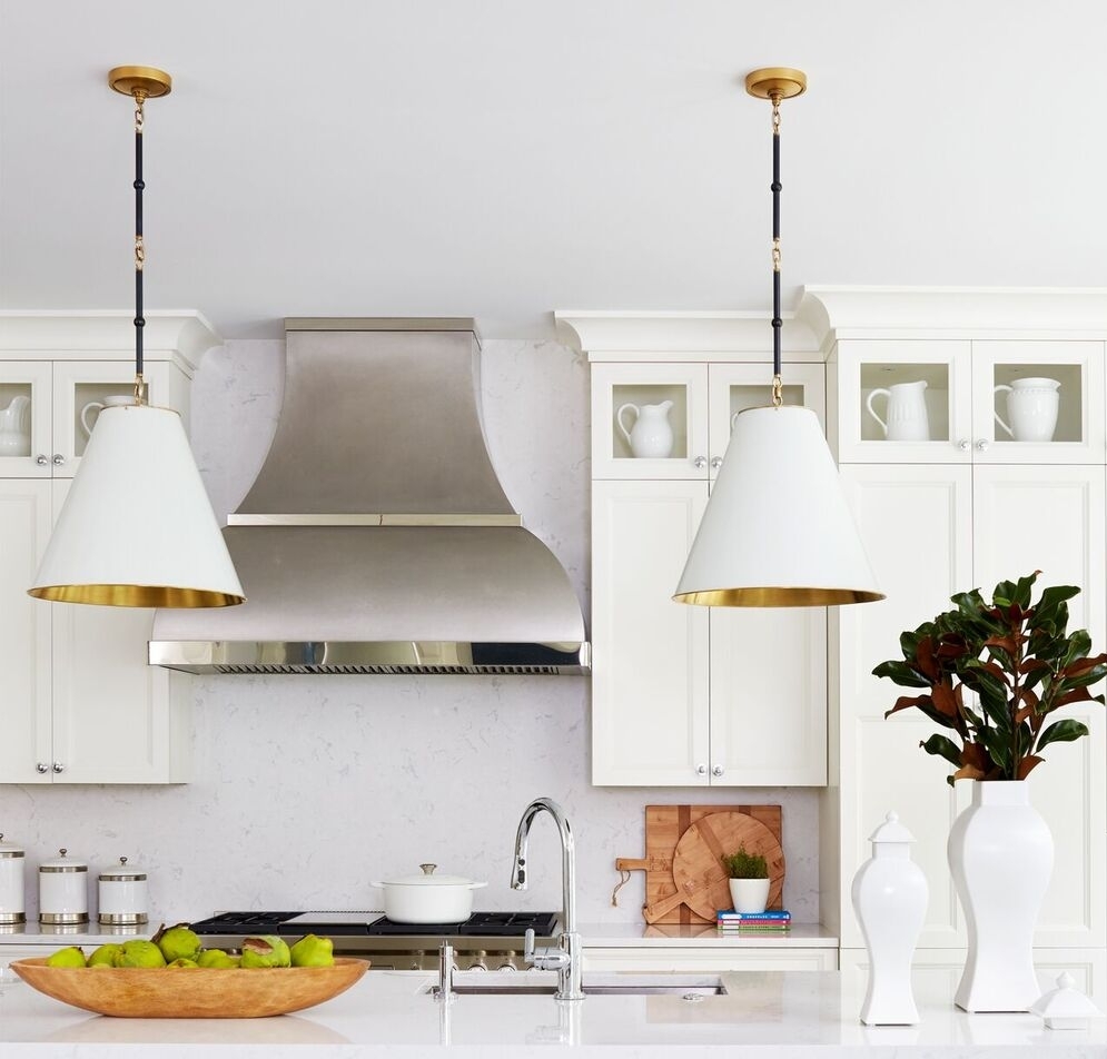
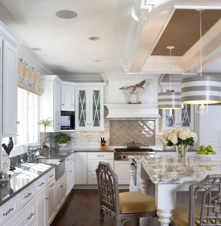
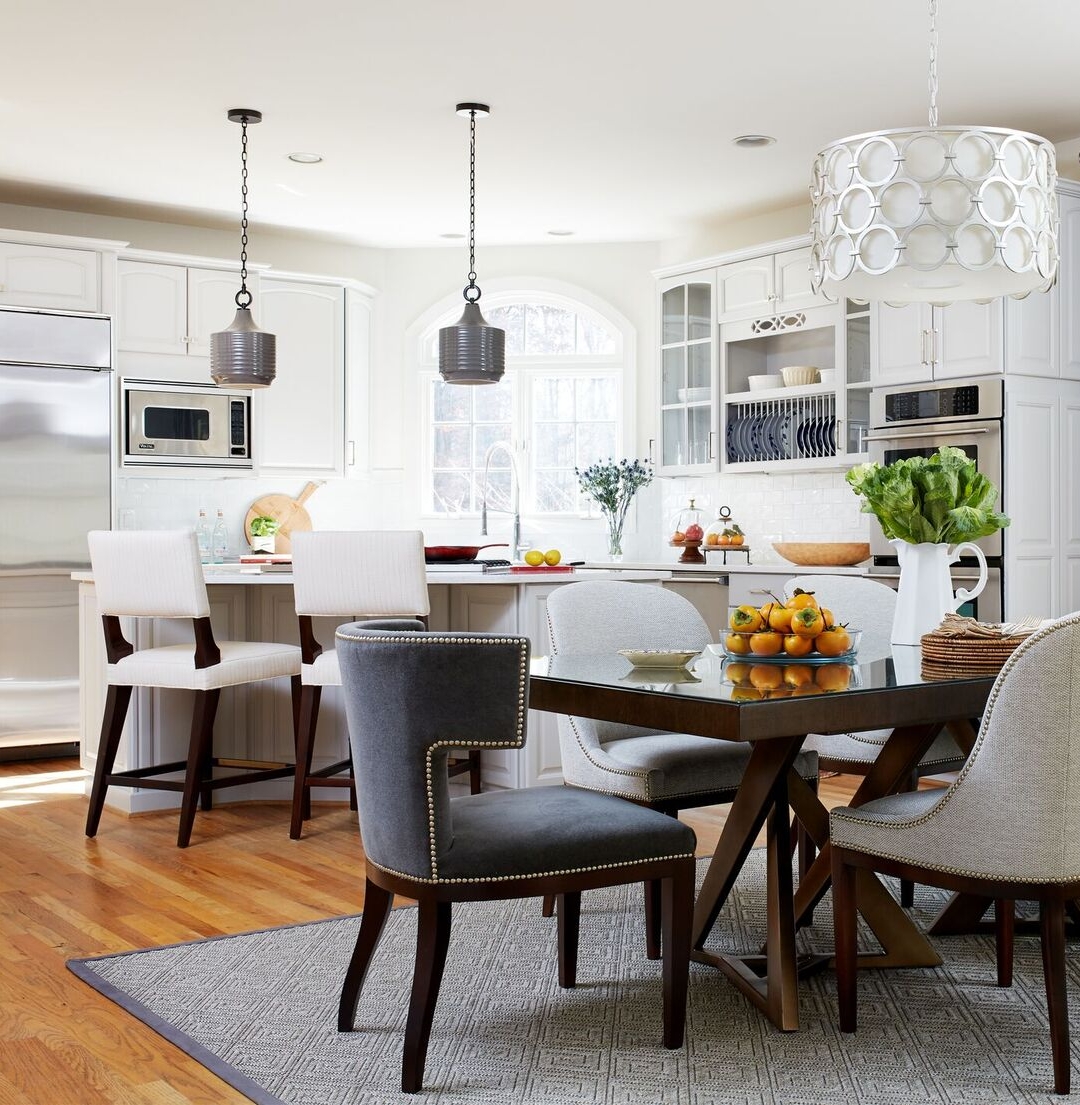
One of the most popular and cost effective ways to upgrade a kitchen is with pendants. Pictured here in our DC project, we updated the kitchen to a more modern-traditional look. The larger pendants are the perfect scale for a larger island. They have a gold underlay and black chain that provide a modern twist on the classic cone shaped pendant. To the right we created a contemporary look with the help of stunning Barbara Barry pendants.


Dining Room

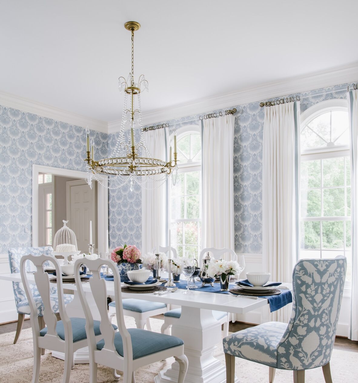
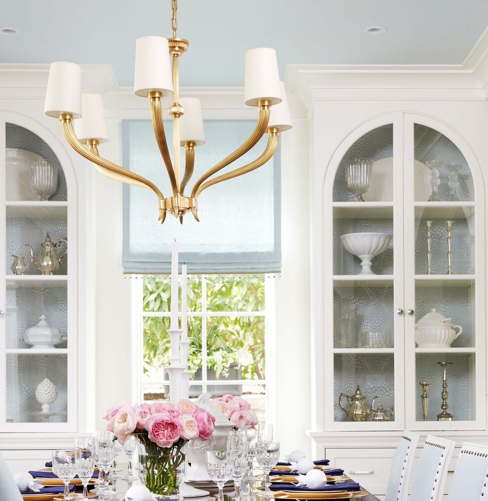
The dining room is the perfect space to let the lighting make a statement. You and your family are not in the dining room everyday (unless you like to eat like a royal). This space is generally reserved for entertaining guests, so give them a show with a fabulous chandelier to ogle over. If dinner wasn't perfection, they'll leave remembering the beauty of the atmosphere. I love the way these chandys make a big pop, even against all the color and pattern play –they play the leading role.


Foyer

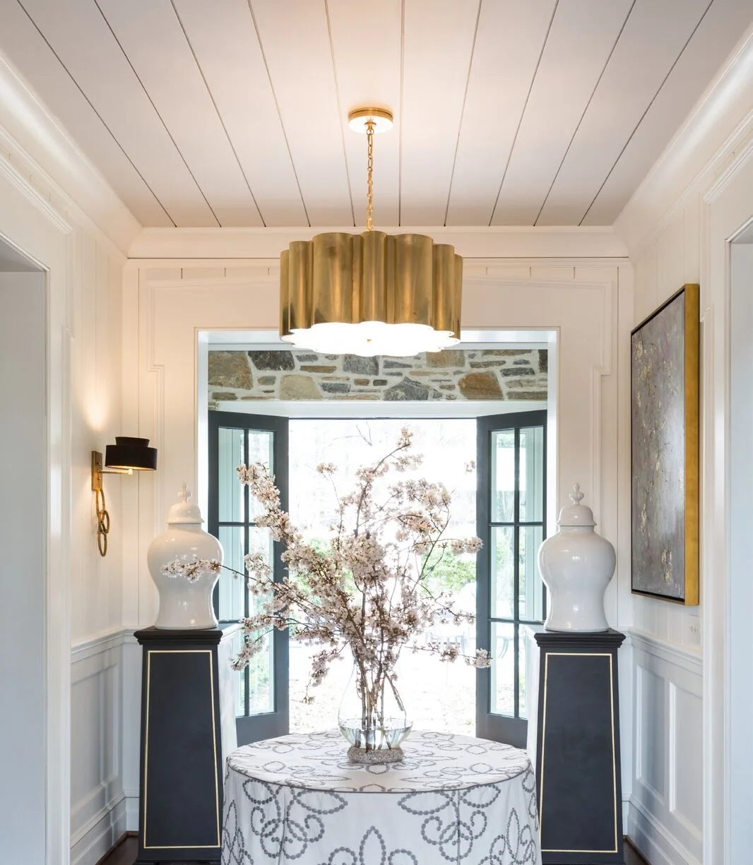
The Foyer is sometimes small and other times mighty. But it is your home's first impression. Hence, your light fixture should make a big impact. This is your chance for a dramatic entrance, or at least something that makes you smile each time you walk in the door.


Bathroom

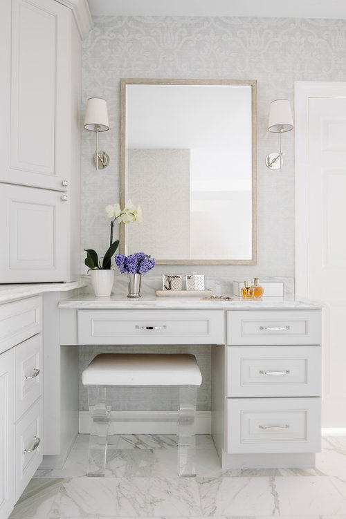
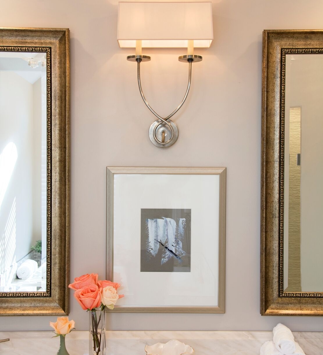
Chandeliers also have their place in a powder room, but there isn't a setting I love more for a gorgeous wall sconce than a bathroom. A little goes a long way when you adorn the walls with the prettiest jewels.
 

Bedroom

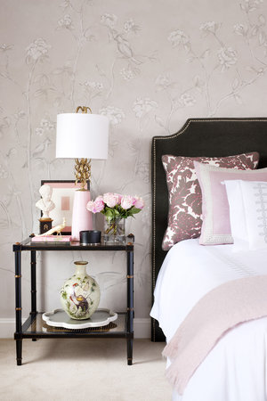
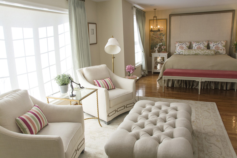
Here is the optimal room to set the mood. Below we flanked the bed with a pair of Ro Sham Beaux soft pink table lamps. Size and height are important so we used updated shades. The bedroom is the ideal space in your home to create a romantic and serene sitting area. A morning coffee in PJs may be your only chance in a busy day to steal a tender moment with your spouse.
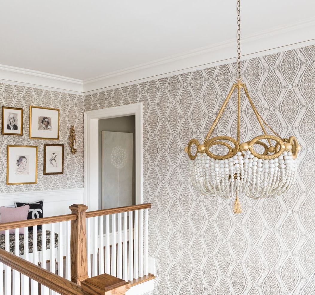
 

Don't forget to have a little fun in the hallways! Use every possible nook and cranny of your home to create depth and character.